When we were introduced to the task for our final brief and I saw the list of books, I immediately knew I want to illustrate The Metamorphosis by Franz Kafka because it’s one of my favourite books. I find the main character, Gregor Samsa, very relatable and I think I can understand his feelings.
I didn’t know what I was going to do, but I was sure that I don’t want to draw him as a cockroach. I don’t think he should be depicted as a giant insect because the cockroach is only a metaphor for depression and him being unable to communicate with people. I wanted to depict him as a man but I also needed to include the cockroach and him being transformed into the insect.
When I was looking for some ideas, I started with his room. The book was written in 1915 and Kafka lived in Prague, so I researched interior and furniture design in the 1900’s era. I used mainly Pinterest and a book by Caroline Clifton-Mogg “The Bedroom Book”. Gregor didn’t belong to a high social class; I think he was a lower middle social class, so I tried to give him only a simple bed.


I looked for different artists and the most appealing to what I wanted to do were a Danish artist Riana Moller and an American artist Jared Nickerson. Moller’s art includes different techniques including flat colour or realistic shading. When I looked into early 1900’s illustrations, they were mostly in flat colour with line art so I decided to do this technique. Nickerson’s art is usually made in a vector with contrasting line art which I could do with ink or liner, vectorize it and then colour it digitally. The next art style I thought of was a silhouette. It could work with text and vector pretty well but I wasn’t sure how it would work with other two illustrations. I wanted to stick to similar style and colours but when I looked at Alisson Roussell’s silhouette art, I decided I will try it.


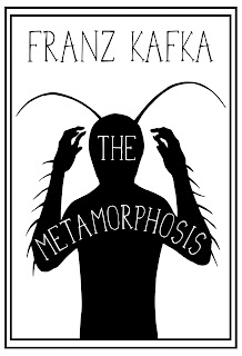
My silhouette is Gregor who is about to grab his head in his hands and scream because he is changing and he has no idea why. There are antennae and insect hair on his arms showing us his transformation. I made it for a quote which I wrote in font I made and I put it inside of the silhouette. I really like how it worked and I think it would also look nice as a laser engraving into wood.
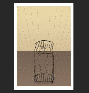
For my second illustration, I also wanted to work with a quote. I like illustrating quotes in general so I chose another one. I drew it from the birds eye's view because I thought it may be interesting to see Gregor in the beginning of the day when he just woke up and felt the change. He is lying on his back in the bed, staring at the ceiling with an empty gaze and the quote is one of his thoughts. I drew a cockroach also lying on its back and put it onto him as a stamp. The cockroach and the word “nonsense” are both in red colour because I wanted to show the absurdity of his situation.
As a gif, at first, I wanted to draw Gregor sitting on his bed changing into a cockroach and back. However, it didn’t really fit into my colour theme and style so I tried to find another idea connecting the first two illustrations. I made a portrait of Gregor who has antennae like the silhouette and his eyes are black, showing how dead inside he is because of the depression. The antennae are red because I decided to make the colour red as a significant colour for the cockroach because the meaning of red colour isn’t only love and passion but also anger, stress and danger. I added two small cockroaches to make it look like a card. It wouldn’t work as a gif very well so I worked with the second illustration and made the cockroach flickering together with the red highlighted word “nonsense”. In the end, I added a black double frame to all of them to make them more connected to each other and I think it adds the vintage style to them.
In the conclusion, I think my illustrations portray the story quite well and they also have the vintage but also modern style mixed together. When I look at them now, I could probably try to work with different textures and brushes but overall I can say they successfully work as illustrations of the story.
(864)
Bibliography
Clifton-Mogg, C. (2003). The Bedroom Book. 1st ed. London: Mitchell Beazley.
Kafka, F. and Wyllie, D. (2005). Metamorphosis. 1st ed. [ebook] The Project Gutenberg. Available at: http://www.gutenberg.org/ebooks/5200 [Accessed 4 Apr. 2017].
Moller, R. (2017). Fealasy on DeviantArt. [online] Fealasy.deviantart.com. Available at: http://fealasy.deviantart.com/ [Accessed 29 Apr. 2017].
Nickerson, J. (2017). Behance. [online] Behance.net. Available at: https://www.behance.net/j3concepts [Accessed 29 Apr. 2017].
Project, S., Bourn, J. and Bourn, J. (2017). Meaning of the Color Red | Bourn Creative. [online] Bourn Creative. Available at: http://www.bourncreative.com/meaning-of-the-color-red/ [Accessed 29 Apr. 2017].
Russell, A. (2017). Alison Russell | Silhouette Artist. [online] Alison-russell.co.uk. Available at: http://www.alison-russell.co.uk/ [Accessed 28 Apr. 2017].
Russell, A. (2017). Silhouette Artist - Portrait Cuttings - UK. [online] Silhouette Artist - Portrait Cuttings - UK. Available at: https://silhouetteart.wordpress.com/ [Accessed 28 Apr. 2017].


